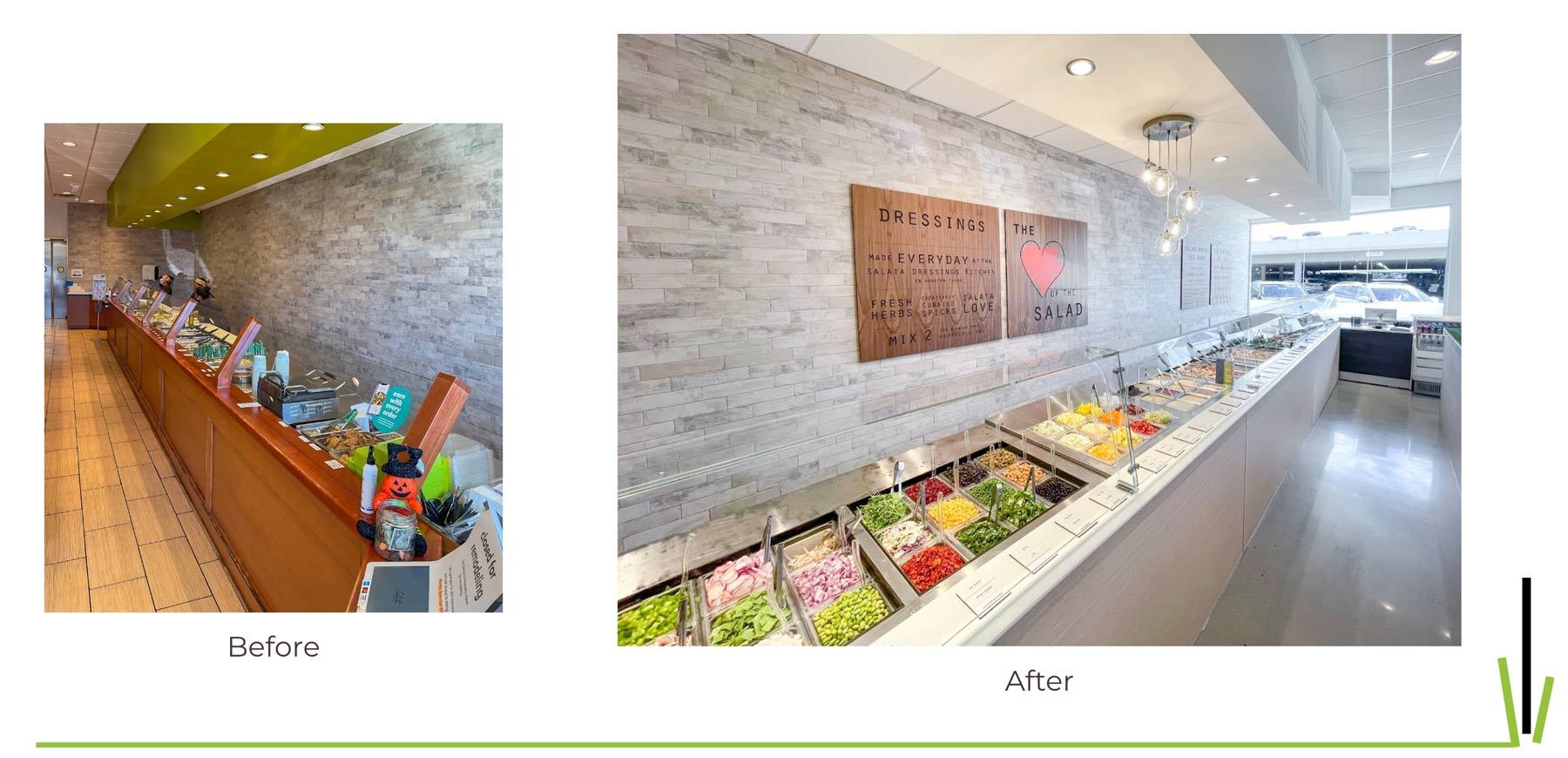
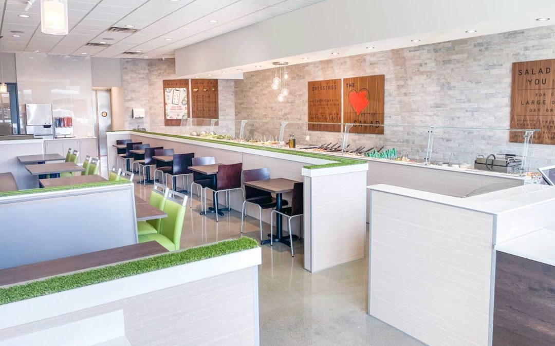
A new restaurant prototype from the franchised salad chain Salata is fresh, modular design, and one that was designed to flex to a market’s market demand for off-premises.
Julie Davis, the vice president of franchise development at Salata, said it’s a major update to the brand’s image, and will help them keep up design wise with the growing number of salad-focused competitors. She said it was important that the new design matches the quality of the food.
“When we look at our product offering and then look at our outdated design, it didn’t match,” Davis said. “We needed to upgrade our facilities to reflect the product we’re serving. It was getting that in line just to keep up with the competition. There’s a lot of folks entering this segment so it was necessary to keep our operators competitive.”
She said the new template “pops” and makes the fresh, colorful food the center of the dine-in experience. It’s bold, bright and modern approach to restaurant design. Something akin to what salad-eaters might see in a trendy chain like Sweetgreen or Freshii.

As much effort went into the design, there was as much of of focus on making off-premises flow better than before. The brand reaches 80 percent off-premises at some locations, a portion of sales that increased dramatically during the pandemic and remains very high across its locations.
Davis and her team worked that into the design with decor and signs directing off-premises customers and delivery drivers where they need to go to find their pick-up orders. The new prototype also includes a section of the kitchen dedicated to that huge portion of off-premises orders.
“Previously, when an online order came in, it was built on the same order line as the guest that was in store,” said Davis. “With the shift to off prem, we had to create an online order prep area in the back of house. That thought was with the design of the pickup area, so it creates ease for the operator and it takes those orders out of the flow for our in-restaurant customer.”
Of course, that’s nice for the customer experience. Nobody has to wait for an online order to move down the line. It also helped with order accuracy. Davis said because there were customers to chat with, salads to make, ingredients to grab, accuracy of online orders became an issue. Already in the few updated locations, there has been an uptick in accuracy and guest satisfaction.
One of her favorite things about the new design is how easy it is to install. Anyone developing or updating a restaurant these days knows how difficult it is to meet a timeline, stay within budget and engage with local officials around permits. She said a designer helped the team create a solution to all those current headaches.
“What they did was transform it and drop the cost down. They figured out how to pre-manufacture all the components. So really what they did was change it form construction to installation, you can complete it all in nine days,” said Davis. “So, you reduce the number of trades required that drives the cost down. And you don’t have to pull permits because you’re not doing any electrical or plumbing work, you’re just installing it.”
She said it was a little more complex than your standard Ikea dresser (hopefully with better instructions). It’s also easy to tear down and move if a restaurant, driving the cost and complexity of a move down dramatically.
The modularity also allows operators and the corporate development team to create a design that will match the level of delivery in an updated location or the projected level of delivery in a new location.
“It gives us a great perk because we’re so flexible in our footprint. We really study the trade area the competition and then can predictably say this looks like X market and tend to say, this is the most compatible restaurant to this trade area and make some design choices,” said Davis. “We can see that this one is 80 percent off-prem and let that be a guide into great real estate and design choices.”
She said it’s a new methodology for the company and helps ensure operators are making the right investments in both sides of the business. That, she said, ensures fewer wasted costs at development, but also as the location operates. The right size, right design for the market means fewer wasted labor hours for someone overseeing an empty dining room, for instance.


