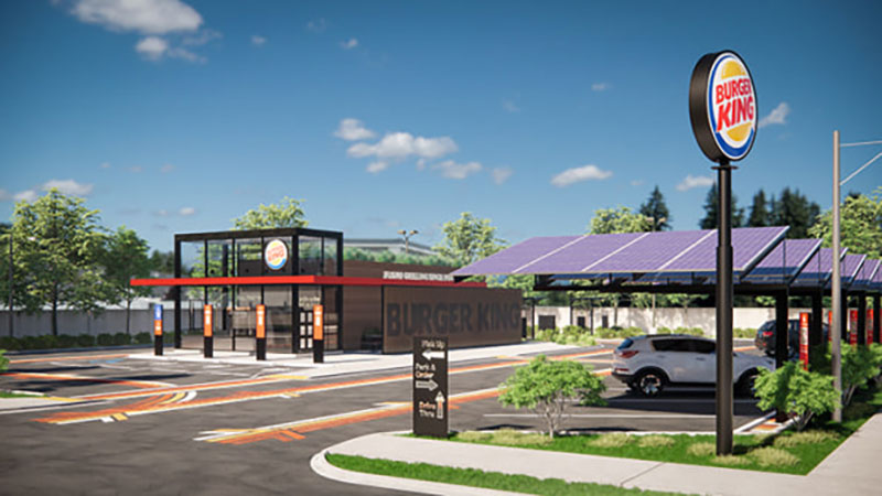
Burger King released renderings for its next-generation stores that have no dining rooms, a small-scale solar panel farm and countless ways for off-premises orders to reach delivery drivers or customers who either walk up, use any one of three drive-thru lanes or park in an array of order-pickup spaces. Compared to the Taco Bell prototype we recently reported on, Burger King’s new template steps even further into a future that will feature fewer dining rooms from quick-service restaurant brands.
Created by BK parent, Restaurant Brands International, its new store designs were drafted with input from tech, operations and food innovation teams to dramatically improve the Burger King guest experience. The new designs will provide multiple ordering and delivery modes and highlight a physical footprint that’s 60 percent smaller than a traditional Burger King restaurant building and site.
“In March our in-house design and tech team accelerated new restaurant design plans and pushed the limits of what a Burger King restaurant could be,” said Josh Kobza, Restaurant Brands International’s chief operating officer. “We took into consideration how consumer behaviors are changing and our guests will want to interact with our restaurants. The result is a new design concept that is attractive to guests and will allow our franchisees to maximize their return.”
The reimagined restaurant blueprints emphasize:
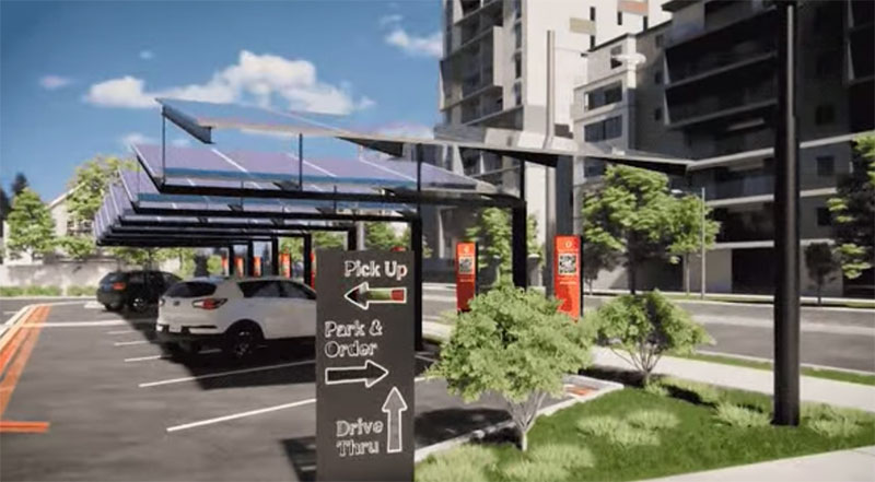
- Drive-In. Guests will be able to park their cars in the drive-in area under solar powered canopies, place their orders through the BK App by scanning a QR code at their parking spot, and have food quickly delivered to their cars.
- Curbside Delivery. Advance orders placed through the mobile app will have dedicated parking spots for curbside delivery. Guests will be able to notify the restaurant team member upon arrival via the app as instructed on the parking signs.
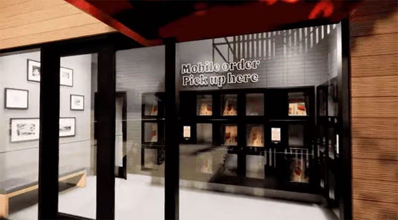
- Pick Up Lockers. Mobile and delivery orders can also be picked up from coded food lockers facing the exterior of the restaurant. The food will come straight from the kitchen to the pick-up lockers.
- On-Premises Dining. One design option replaces the traditional indoor dining room with a shaded patio featuring outdoor seating for guests who prefer to dine on-premise.
- Drive-Thru. A double or triple drive-thru features digital menu boards and merchandising. The multi-lane ordering and pick-up expedites the process, while a living wall frames the guest’s view into the kitchen interior, featuring the company’s traditional flame broiler. An external walk-up window on the glass facade will also be an alternative ordering point for takeout.
- Suspended Kitchen and Dining Room. One design option features a suspended kitchen and dining room above the drive-thru lanes configured to reduce the building footprint, making it ideal for urban locations. Drive-thru guests have their order delivered from the suspended kitchen by a conveyor belt system, and each lane has its own pickup spot. This restaurant design option features a triple drive thru with a dedicated lane for delivery drivers.
- Guests who want to dine in can enjoy the dining room and covered outdoor seating situated above the drive-thru entrance. The design of this restaurant allows a fully touchless experience.
“The designs we’ve created completely integrate restaurant functionality and technology. The restaurant of the tomorrow merges the best functional technology with unique modern design to elevate our Burger King guest experience,” said Rapha Abreu, global head of design at Restaurant Brands International. “We designed the interior and exterior spaces like we had a blank sheet of paper, designing without preconceived notions of how a Burger King restaurant should look.”


The first new designed restaurants will be built in 2021 in Miami, Latin America and Caribbean. To preview restaurant design renderings visit https://youtu.be/vwpz-wBqo4k and https://youtu.be/qoHONJCu4T0.


